Amelia Kohm, PhD, Founder of Data Viz for Nonprofits (DVN), spoke on how to make data more visual and useful during our Accelerate Speaker Series in ResultsLab’s Impact Collective community.
In this blog post, we share highlights from the session.
Data is a communication tool that can work for or against us. When used right, it can be a tool to tell stories, build trust, and boost confidence. When used wrong, it can create confusion, lose attention, and erode confidence.
As a nonprofit, data is an essential ingredient to:
- Show a need for your nonprofit’s service
- Show how your nonprofit is unique
- Show the impact your nonprofit has
- Evaluate and plan your nonprofit’s programs
The right data, and the right use of data visuals, can help you make the case for each of those purposes. It can be easy to get those pieces wrong, but here are 10 things to consider that will help you get them right.
10 Steps to Improve Your Next Data Visual Project
1. Clean data
Everything depends on the consistency and quality of your data. Without clean data, you can’t have a clear story. This is an important step that can’t be skipped.
Dive deeper: Tableau has a great guide on data cleaning and preparation that you can check out.
2. Encode thoughtfully
Certain shapes, colors, and diagrams are easier for us to make accurate comparisons than others. Think about the story you want to tell with your data, and the best way to present that data.
Do you have a set of data that you want to compare different categories, such as age groups, zip codes, genders, etc? The best visual for your audience in this case might be a bar chart. Or do you have a set of data that you want to show a change in trends over time? In this case, a line graph might be the best visual to use.
The four common presentation types are:
- Comparison
- Composition
- Distribution
- Relationship
Dive Deeper: Understand what you’d like to show, and then choose the right chart to present that. Check out this diagram for choosing a good chart.
3. Highlight What’s Important
What is the main point you are trying to tell in your data story? Highlight that point. Emphasize it in a color that stands out against the other data points.
Think about how you can use color to make your point easily scannable. Use greys to push some details to the background and emphasize only the most important points using bolder colors. This will help your audience more quickly process information
Dive Deeper: See this simple before-after data viz example and explanation from Stephanie Evergreen.
4. Show Order
Order is how things are organized or the specific way things are arranged, like arranging books by color or a group of students from youngest to oldest. Putting things in order helps us detect patterns, making things neat and easy to understand.
To help your audience more easily understand your data, arrange your charts in order. For example, arrange bars on a bar charts in descending order so that viewers can easily pick out the top/bottom or the most/least.
Dive Deeper: Amelia shares a great example from a chart used in The Economist in this blog post on showing order in our data visualizations.
5. Clarify with Color
Use colors sparingly and strategically. Choosing the colors might seem like a simple task, but the colors you choose have meaning, and can make your visuals confusing. If you use too many colors, your audience will get lost. If we choose colors that are bright a fully saturated, your audience might feel as if you’re yelling at them.
Dive Deeper:
- Cole Nussbaumer Knaflic covers seven lessons on how to use color in your data visualization in this video.
- It’s also important to consider what your visuals might looks like for someone who’s colorblind. Datawrapper wrote a 3-part series covering how your colorblind and colorweak readers see your colors, what to consider when visualizing data for colorblind readers, and what’s it like to be colorblind
6. Delete the Unnecessary
Details can help or hinder your story. We all have that person in our life that tells a story with too many details. The person who’s telling you about a time they found their car keys in the freezer, and what time they woke up, what they ate for breakfast, the color of their shirt… and you keep asking yourself, what does that have to do with your keys being in the freezer? The details you share need to matter, otherwise you will lose people if they have nothing to do with the point of your story.
The same goes with charts. If there are lines, numbers, or legends that are unnecessary to the point you are trying to make, remove them.
Dive Deeper: Cole Nussbaumer Knaflic shares an example here on how to declutter your data charts.
7. No Unjustified 3D
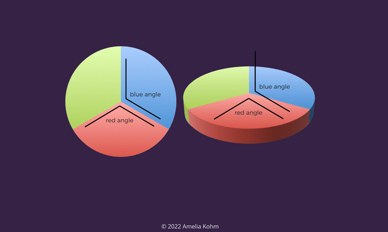
You’ll hear data viz experts say it all the time, ‘Never use 3D!’ but they rarely clarify why. The reason 3D visuals are not recommended is because they reduce comprehension and show incorrect proportions. To convey the illusion of something as 3D, you have to distort the visual. You have to make parts larger or smaller to make the perception of something being closer or farther.
Amelia shared a great example where you can see how the angels on the 3D chart are distorted from the angles on the 2D chart.

You want your audience to quickly be able to make accurate comparisons when they see your visuals. This relates to the point above on encoding thoughtfully.
8. Eyes Beat Memory
If you are creating multiple charts to compare against each other, keep them on one page. It’s easier to move our eyes side to side comparing charts, than it is having to hold one chart in memory from one page and comparing it to the chart you’re looking at on another page.
9. Zoom in
If you’re working with a series of visualizations, start with the most general or high level chart, and then zoom in. The data viz example Amelia shared was a data set from the Center for Disease Control (CDC). The first visual begins with a wide view showing how prevalent all chronic diseases are across the United States. The next visual zooms in and shows the prevalence of a particular disease in a particular state. Then the final visual zooms in again, allowing viewers to drill even further into the data and explore how various risk and protective factors (diet, smoking) relate to the prevalence of different diseases.
10. Viz is not always better
There are times when charts aren’t your best option, and you should use a table. This might be when your audience needs to compare or look up individual values, and they are comfortable diving into the data details. You might also want to use a table your values involve multiple units of measure.
Recommended Resources:
- Data to Action Resource Handout
- Impact Collective (*must be a member to access these resources)
- *Webinar Recording
- *Data Action Planner – a simple and effective tool for defining concrete actions to take based on data learnings.

