Nonprofits are under more pressure than ever to prove impact with less. Funding has tightened, competition for grants has intensified, and boards and funders alike are asking harder questions about results. In this environment, the organizations that can point to real outcomes — not just activity counts — are the ones winning trust, funding, and staying power.
At ResultsLab, we work with hundreds of nonprofits across the country on exactly this challenge: building the internal muscle to use data for better program decisions, and to tell stronger, more credible impact stories. Here’s the framework we use, and what we’ve learned from organizations doing this well.
The Continuum: From Anecdotes to Impact
Most organizations’ data maturity follows a predictable path:
- Anecdotes. A single powerful story from a frontline staff member or participant. Valuable, but not systematic — one story can’t represent the whole program.
- Outputs. Counts of activity: how many people served, how many sessions held, how often participants attended. Most nonprofits have this well in hand.
- Outcomes. The actual change produced — shifts in knowledge, behavior, confidence, or skills. This is where most organizations get stuck: they have plenty of output data but struggle to connect it to real change.
- Impact. The long-term, mission-level shift — the “so what” behind the outcomes. For a youth program, that might mean high school graduation and a strong transition to a thriving post-secondary path.
The goal isn’t to abandon outputs or anecdotes — it’s to build the connective tissue between all four levels, so your data actually explains why your work matters.
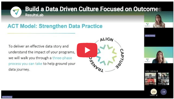
A Framework for the Journey: Align, Capture, Transform
Moving along that continuum takes structure. We use a simple three-phase framework:
Align. Before collecting more data, get clear on your outcomes and who you’re trying to change them for. Many organizations skip this step and jump straight to tools — a new survey, a new dashboard — without a clear tether back to what they’re actually trying to learn. Skipping Align is the single biggest reason organizations end up with piles of indicators nobody uses.
Capture. Once your goals are clear, decide what to measure, for whom, and how — methods, tools, and (critically) your team’s actual capacity to collect data consistently. The best tool in the world doesn’t help if no one has the bandwidth to use it well.
Transform. This is where most organizations lose momentum. They have decent data collection practices and plenty of data, but never turn it into something usable — a decision, a story, a change in practice. Transform is where data actually earns its keep.
Using Data to Drive Real Decisions
One of the clearest ways to see this in action: a partner organization facing a roughly 25% program budget cut had to decide which components of its programming were essential to achieving its outcomes, and what participation frequency was actually driving results.
Rather than cutting across the board, the team:
- Defined the specific questions they needed answered.
- Mined their existing data rather than starting a new collection effort from scratch.
- Analyzed how participation frequency and different activity areas correlated with outcomes.
What they found: attending three times a week produced the same outcomes as attending four or five times a week, and two of their five program activities weren’t gaining traction with participants. Based on that, they consolidated from five program components to four and reset expectations to three sessions a week.
The result wasn’t just a leaner budget. Staff reported real relief from an unsustainable workload, the organization kept its full team intact, and — perhaps most notably — sharing this learning process transparently with a funder led to additional, unsolicited funding support.
Building the Habit, Not Just the One-Off Analysis
Case studies like this are memorable, but the real value comes from making data use routine. A few low-lift structures we’ve seen work:
- Monthly data dialogues — a standing agenda item where the team reviews dashboards and asks what’s changed and what needs adjusting.
- Strategic deep dives — periodic, focused analysis sessions built around a specific learning question, followed by structured reflection (what is the data telling us, why, so what, now what).
- Data moments in staff meetings — surfacing a single data point regularly and asking the team to reflect on what it means.
- Making data physical and visible — in one example, a youth-serving organization invited community members to respond to a prompt about their program’s impact in a shared physical space, turning data reflection into a visible, participatory exercise.
None of these require new software. They require making data reflection a habit rather than an occasional event.
Telling a Story That Actually Lands
Data only creates change if it reaches the right audience in the right form. The starting point is always: who, specifically, are you trying to reach — funders, corporate partners, community members, your own staff — and what does that audience actually need to see?
A simple, reliable frame for building any impact story:
- Who / what — the mechanism of change: who you serve and what you do.
- What changed — the actual outcome, stated clearly.
- Why it matters — tied to your broader impact, relevant research, or field-level context.
- Voice — the people experiencing the change, in their own words.
The format varies by audience. Institutional funders may still expect formal reports, but we’re seeing a real shift toward more creative, human formats — short videos, one-pagers, interactive dashboards — even among traditional funders. Some organizations condense an annual report into a two-minute video built around the same narrative arc. Others build simple, board-friendly “outcomes at a glance” visuals that let leadership filter by program area and drill into the underlying evidence with a click. Internal, staff-facing dashboards can go deeper and stay more exploratory, while external one-pagers stay tight, visual, and story-forward. Social media can carry short “story bites” pulled straight from the same underlying material.
When Your Story Doesn’t Match the Bigger Picture
One of the harder realities of impact work: your program may be working exactly as intended while a broader community trend — homelessness, food insecurity, learning loss — keeps moving in the wrong direction. That gap can be read by funders as a sign the work isn’t landing, when in fact it usually points to something else: root causes and systemic forces outside any single program’s control.
The most credible way to handle this isn’t to downplay the gap — it’s to name it directly: show what’s changing for the specific population you serve, be transparent about the larger context you’re operating in, and use that contrast to make the case for scale, for partnership with organizations addressing adjacent root causes, or for continued investment rather than retreat.
Where to Start
If your organization is earlier on this continuum, the fastest entry point is usually not “collect more data” — it’s mining what you already have against a specific decision or question you’re trying to answer. Build the muscle of using existing data first; the gaps you actually need to fill will surface naturally from there.
Building a data-driven culture isn’t a one-time project. It’s a set of habits — asking better questions, building routines around reflection, and matching your story to your audience — layered on top of good measurement. Organizations that do this well don’t just report better. They make better decisions, retain staff, and build more durable relationships with funders.
ResultsLab works with nonprofits across the U.S. to build impact measurement systems and data-informed decision-making practices. If you’d like to talk through where your organization sits on this continuum, get in touch.